Overview
Early on, MCC committed to building and maintaining a very strong visual brand and, in doing so, requires that any item distributed to the public be appropriately branded according to the guidelines outlined in MCC’s Standards for Corporate Marking.A strong visual brand:
- Provides instant recognition of MCC’s work anywhere in the world;
- Shows that MCC cares about presentation as much as content;
- Showcases the excellent work of MCC staff in an easily digestible way by creating a visual brand based in graphic design best practices;
- Elevates MCC’s materials to those most respected in government;
Using MCC’s Logo
Logo and Signature
The signature is the most appropriate symbol (or logo) to represent the MCC worldwide.It is a combination of three unique elements: the MCC logo, the brand name, and the tagline. (For an explanation and usage rules specific to these elements, see Seal, Brand Name, and Tagline in the Standards for Corporate Marking and Branding.)
While each of these elements has its own usage standards, when displayed together as the signature, these usage rules apply:
- The signature should be used anytime both the logo and the company name appear together.
- The signature is to be arranged in only two formats: horizontal and vertical. The vertical format is the preferred format. It may not appear in any other format.
About MCC’s Logo
MCC’s logo, a star formed in the classic shape of those on the American flag, is an emblem of the partnership and progress that this innovative way of delivering foreign assistance is bringing to some of the world’s poorest countries.The logo contains sweeping stripes of red and white, symbolic of roads or fields that are part of many MCC programs, as well as three stars representing the principles of aid with accountability, country ownership and partnership, and results-based assistance that define MCC’s cooperation with countries across the globe.
The logo is energetic, giving a sense of forward motion and progress, of long-term and sustainable economic growth, and of the partnership that takes place when two countries work together through Millennium Challenge Corporation programs.
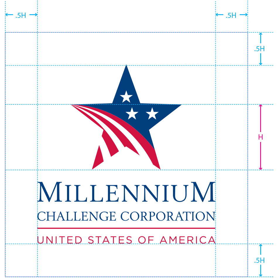
Vertical Signature

Minimum Size
The minimum width for the vertical signature is 1.25” (printed) and 175 pixels (on-screen).Clear Space

Horizontal Signature

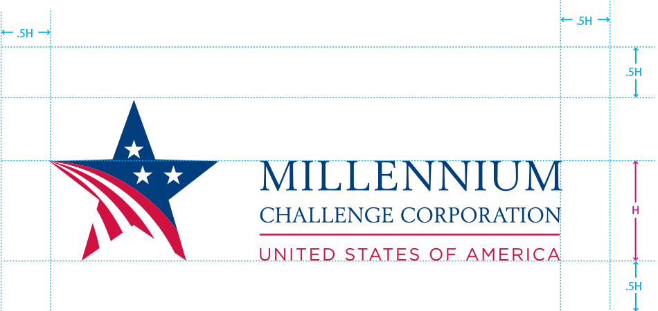
The horizontal signature displays the logo on the left with the brand name to its right and “United States of America” or the tagline immediately below the brand name. The horizontal signature must be placed in either the left-hand or right-hand side of branded material depending on the reading direction of the language used in the produced item. In material produced in English, the horizontal signature must appear on the left. The horizontal signature is never centered and must always be placed towards the side of branded material. (The vertical signature is the preferred signature.)
Minimum Size
The minimum width for the horizontal signature is 1.25” (printed) and 135 pixels (on-screen).Clear Space

Color Palettes
MCC’s color systems help promote the Corporation as a grantee of United States foreign assistance and help convey our mission and values.The three color systems are:
To ensure color accuracy and consistency throughout all MCC print, on-screen, and Web communications, the MCC used the world-standard Pantone Matching System (PMS) to define the colors used in its color systems.Brand Color System
Three colors comprise the brand color system:- Blue
- Red
- Black
| Color Space | U.S. Flag Blue | U.S. Flag Red | Black |
|---|---|---|---|
| Pantone (PMS) | 281 | 193 | |
| CMYK | 100, 85, 5, 20 | 2, 100, 60, 11 | 100, 100, 100, 100 |
| RGB | 0, 38, 100 | 187, 19, 62 | 00, 00, 00 |
| Web | 00 26 64 | BB 13 3E | 00 00 00 |
Default Color System
MCC adopted U.S. flag blue and U.S. flag red in mid-2007 to visually bolster its mission within the U.S. government and to visually strengthen worldwide its association to the United States.MCC uses the Pantone-determined values for U.S. flag blue and U.S. flag red. Two additional colors comprise the total default color system. Tints of these colors may be used in addition to the full-color value.
| Color Space | U.S. Flag Blue | U.S. Flag Red | MCC Pale Blue | White |
|---|---|---|---|---|
| Pantone (PMS) | 281 | 193 | 2727 | |
| CMYK | 100, 85, 5, 20 | 2, 100, 60, 11 | 75, 40, 0, 0 | 0, 0, 0, 0 |
| RGB | 0, 38, 100 | 187, 19, 62 | 61, 126, 219 | 255, 255, 255 |
| Web | 00 26 64 | bb 13 3e | 3d 7e db | ff ff ff |
Supporting Color System
In 2008, MCC began developing its supporting color system. While the primary goal of MCC’s overall color system is to promote MCC as an American initiative, the colors in the supporting system intend to complement that goal.Six colors will ultimately comprise the supporting color system and will represent the various sectors in which MCC works. The colors currently being tested are displayed in the table below. These colors are subject to change.
Tints of these colors may be used in addition to the full-color value.
| Color Space | Bright Yellow | Charcoal Grey | Aqua Blue | Deep Green | Earth Brown | Purple |
|---|---|---|---|---|---|---|
| Pantone (PMS) | 116 | undefined | 291 | 357 | undefined | 255 |
| CMYK | 0, 12, 100, 0 | 36, 3, 0, 0 | 83, 19, 73, 58 | 55, 96, 6, 25 | ||
| RGB | 254, 203, 0 | 160, 207, 235 | 39, 89, 55 | 110, 44, 107 | ||
| Web | fe cb 00 | a0 cf eb | 27 59 37 | 6e 2c 6b |

