These guidelines describe the appropriate usage and application of MCC’s 20th Anniversary visual identity, including the logo, tagline, color palette and time frame.
Logo
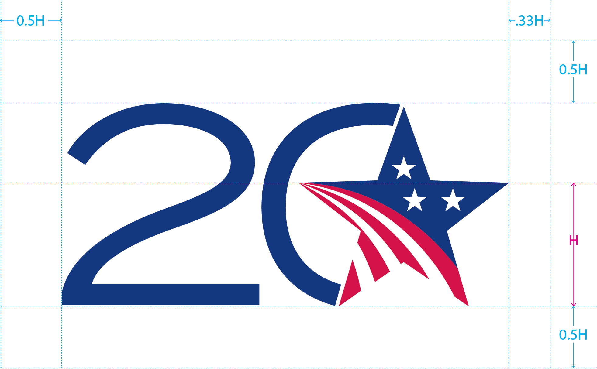
MCC’s 20th Anniversary logo is comprised of the MCC five-pointed star joined with the number 20. This simple, elegant combination combines the most memorable element of MCC’s logo—the star—and the number 20 in an understated way that honors and represents this important milestone.

Color Variations
The logo has three color variations:
- Full color, Platinum

- Full color, U.S. flag blue
- One color
For any material produced in full color, use one of the two full color logos. For any material produced in one color, like black and white, use the one color logo.
No color or shade on the logo should be changed at any time.
Usage
The 20th Anniversary logo must always appear with MCC’s signature on the same product. The 20th Anniversary logo and MCC signature do not need to appear together, but both must appear somewhere on the product. When using the 20th Anniversary logo, it should have priority in size and placement over MCC’s signature.
Lock-Ups
Lock-ups are a combination of multiple elements to create a more recognizable mark. And in many cases using a lock-up is an easy way to meet the basic usage requirement of having both the 20th logo and the MCC signature appear on the same product.
These are the four approved lockup styles available in each color variation:
- Brand name and 20th logo vertical
- Brand initials and 20th logo vertical
- Brand name and 20th logo horizontal

- Brand initials and 20th logo horizontal

Dark Backgrounds
Use the dark background logo and lock-up files when placing the logo on a dark background or when a higher contrast is necessary.
Minimum Display Sizes
The 20th Anniversary logo should never appear any smaller than:
- Print: 1 inch (or 72 points, 2.54 cm, 25.4 mm)
- On-screen: 48 pixels (or ½ inch, 1.27 cm, 12.7 mm)
Typeface
The number 20 in the logo is set in Termina Regular. This is the only instance where this typeface and type family should be used.
Clear Space
Clear space is the minimum amount of empty area that must surround the logo before another item is placed next to it.
Tagline
MCC’s 20th Anniversary tagline—“20 Years of [Economic] Growth”—encapsulates the breadth and depth of MCC’s work over the past 20 years and into the future. It is dynamic in that it is a standard phrase that can be customized based on context. See the Dynamic Tagline section below.
Color Variations
Any color from the 20th Anniversary color palette may be used for the text color of the tagline. On a solid background or background where high contrast is necessary the tagline should appear in white.
Usage
The 20th Anniversary tagline must not be used on materials without the 20th Anniversary Logo.
Dark Backgrounds
On a solid background or background where high contrast is necessary the tagline should appear in white.
Dynamic Tagline
The word “economic” inside the brackets is intended to be replaced by another word or two-word phrase that describes MCC’s mission, values, achievements or programs in the context in which the tagline appears.
For example, other words might be (but are not limited to):
- Agricultural
- Collaborative
- Data-Driven
- Innovative
- Inclusive
- Poverty-Reducing
- Sustainable
This dynamism is intended to be inclusive and to give creators and participants ownership in the celebration.
Minimum Display Sizes
The 20th Anniversary tagline should never appear any smaller than 9 points (or 12 pixels, 0.125 inches, 0.3175 cm or 3.175 mm).
Clear Space
Clear space is the minimum amount of empty area that must surround the tagline before another item is placed next to it.

Typeface
The tagline is set in Gotham Book. No other typeface or type family should be used to set the tagline.
Downloadables
| Logo | Platinum | Blue | One Color | Dark Background |
|---|---|---|---|---|
| Logo only | ||||
| Logo vertical lockup with initials | ||||
| Logo vertical lockup with name | ||||
| Logo horizontal lockup with initials | ||||
| Logo horizontal lockup with name |
For Adobe Creative Cloud users, Adobe CC Libraries are available for logo files, tagline files and color palettes. Contact creativeservices@mcc.gov for access.
Lifecycle
MCC’s 20th Anniversary identity has a finite lifecycle and is only to be used in three phases for a one-year period from August 2023 – September 2024:
- Introduction, August – September 2023: in this phase, appropriate MCC materials, products and events will begin incorporating the logo, color palette and tagline.
- Broad Usage, October 2023 – June 2024: all appropriate MCC materials, products and events will incorporate the logo, color palette and tagline. The identity should be used broadly.
- Sunset: July – September 2024: usage will diminish and ultimately stop; MCC materials, as they are updated, will remove the 20th logo, tagline and color palette and the logo source files will become unavailable.

